It’s a well-established fact that websites with mobile friendly web designs provide a better user experience. This results in more traffic and increased sales. Savvy web designers have been implementing mobile friendly and responsive designs into their sites for some time now. A move by Google in 2014, however, was intended to drive home the importance of mobile friendly web designs even further.
On November 18th, 2014, Google announced the release of its then-new “mobile friendly” labels for search results. These labels were affixed to sites that Google’s search algorithms judged to be viewed and function properly on mobile devices. Google reps were quoted as saying that they understood that landing on a website that wasn’t mobile friendly can be a “frustrating experience for our mobile searchers”. The goal of the labels was to let mobile web browsers know whether or not the site they wished to visit was supported by their mobile device. While we’re sure they were already quietly experimenting with it before then, Google rolled out its mobile-friendly algorithm update in April of 2015. This triggered some panic among web developers and SEO companies, causing the particular phase of Google’s evolution to be dubbed Mobilegeddon.
 Measuring “Friendliness”
 Measuring “Friendliness”
So what makes for mobile friendly web design? The Google algorithm judges websites based on a wide variety of criteria that influence how a site responds to mobile devices. Specific features it looks for include:
- Absence of Flash (most mobile devices cannot view Flash)
- Readable Text (does not require zooming on mobile devices)
- Fit to Screen (page may be viewed without horizontal scrolling)
- Tap Friendly (buttons and link are adequately spaced for finger navigation)
By 2016, Google found that 85% of all pages in the mobile search results met the “friendliness” criteria and were displaying the mobile friendly label. In an effort to keep mobile search results uncluttered, Google removed the labels. This did not, however, derail its efforts to continue improving user experience on mobile devices.
 Mobile Friendly Web Designs and SEO
 Mobile Friendly Web Designs and SEO
Another update quickly followed on January 10, 2017, which outlined the potentially negative SEO consequences faced by sites that did not support mobile devices. User experience and website performance had always had an impact on SEO. Now, optimizing your website for mobile had officially become a Google ranking factor. In this update to its 2016 announcement, Google stated that pages may not rank as high if their content was not easily accessible to users on the transition from the mobile search results.
By this, Google meant pages that displayed intrusive interstitials such as advertisements before being able to view the content. These create a less than ideal user experience regardless of the device being used. However, they become more problematic on mobile devices due to the small size of the screen. Examples of interstitials that could impact your ranking include:
- Pop-ups that obscure the main content upon navigation to or while browsing the page.
- A stand-alone interstitial the user must dismiss before being able to view the main content.
- An above-the-fold layout that appears much like a stand-alone interstitial, but the main content is below the fold.
It is important to mention that Google uses hundreds of signals to determine ranking. A ranking signal triggered by an interstitial may not have a significant impact on a page that has high-quality content relevant to the search inquiry. Also, some interstitials such as legalese related to the use of cookies or for age verification, login dialog, and easily dismissable banners using a reasonable amount of space would not be affected by this new ranking signal.
Mobile-First Indexing
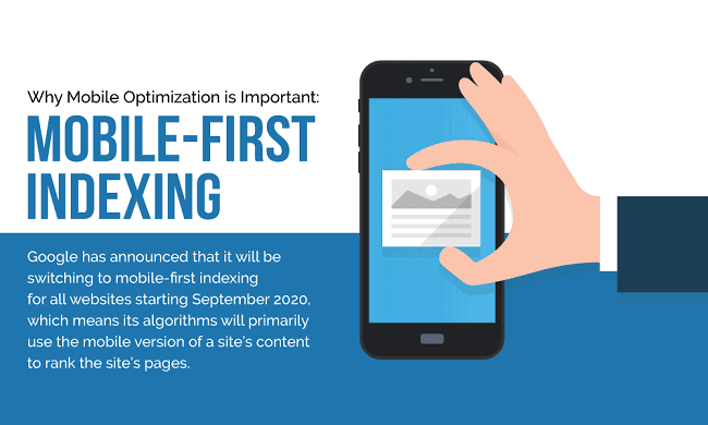
Because performing search inquiries on mobile were quickly becoming the norm, in November of 2016, Google announced that it had begun experimenting to make its indexing mobile-first. According to this announcement, the plan was for its algorithms to eventually primarily use the mobile version of a site’s content to rank the site’s pages. These would also be used to understand structured data and display snippets from those pages in search results.
A year and a half later, Google began migrating websites that complied with its best practices for mobile-first indexing. Fast forward to the current year and Google has announced that it will be switching to mobile-first indexing for all websites starting September 2020. Mobile-first indexing is enabled by default for all new websites as of July 1, 2019.
So what does this mean for existing websites? If you haven’t already updated to a responsive site or a dynamic serving site where the primary content and markup is equivalent across mobile and desktop, now is the time!
Take the Test
 Take the Test
Does your site feature mobile friendly website design? Are mobile users getting the full experience out of your web-page? Have you earned ‘mobile friendly’ status? You can find out in a flash using Google’s own ‘Mobile Friendly Test‘. Just enter your site’s URL, click the ‘Analyze’ button, and find out in seconds. You can also use the ‘URL inspection tool’ to gather information and identify opportunities for improvement to Google’s indexed version of a specific page.
Professional Mobile Friendly Web Designs
If your site fails the Mobile Friendly Test or implementing Google’s mobile-first best practices is more than you can handle, it may be time to call in the experts. We specialize in building responsive, mobile friendly web designs. Every site we build looks and functions elegantly on any mobile device, guaranteeing that customers can view your site anywhere, anytime. Be everywhere your customers are with mobile friendly web design from Creative Click Media.